Design system for a rapidly scaling start-up
SUMMARY
Background
I joined Nukai in March 2023 as their first in-house designer to work directly with the Head of Product on a complete redesign of the platform.
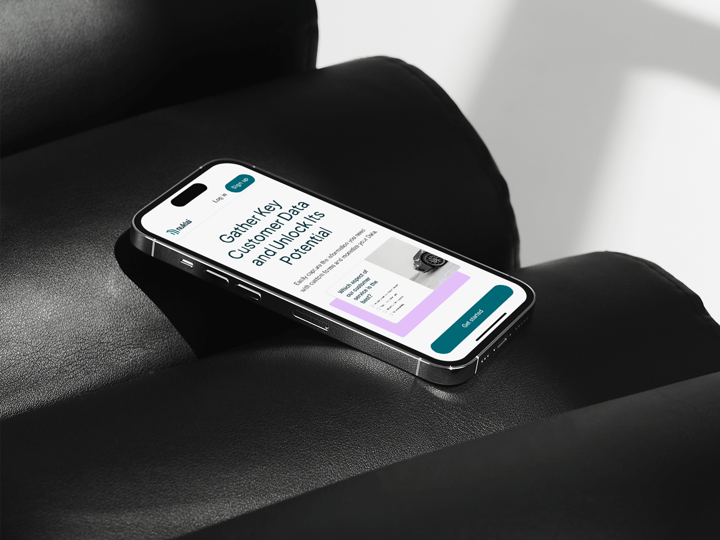
Nuklai is an innovative layer 1 blockchain infrastructure to host a collaborative data ecosystem that will fuel the next generation of AI and Large Language Models (LLMs) with world-class data. As they were gearing up for their next investment round, urgent design expertise was critical - both in terms of a rebrand as well as a thought-out user experience.
One of the key tasks was setting up and managing a new Design System.
Outcome
Details
Scope and considerations
As a solo designer, I had limited time to develop the Design System while managing fast-paced UX work. Since the system needed to scale quickly, with new use cases emerging constantly, I had to take a strategic approach to its growth and evolution.
Collaborating with the Head of Product and Front-End Engineers, I defined both short-term and long-term priorities. Rapid scalability and modularity were key principles, ensuring we met the tight MVP launch deadline. In practice, this meant prioritizing reusable components and a templated approach to layouts whenever possible.
Not just a set of components
Collaborating with the Head of Product, we integrated user research into the Design System and conducted multiple prototype usability studies and discovery exercises. These insights directly shaped the development of the component library and interaction patterns.
Another key focus was designing with real data in mind. While I rely on lorem ipsum for early wireframing, I prioritize using actual data when finalizing components and screens. This helps prevent potential roadblocks, such as:
What if card titles exceed one line?
What if a provider lacks a logo?
What if a card has more than three tags?
By incorporating real data instead of placeholders, I could proactively address these challenges within the design process.
What if a provider lacks a logo?
What if a card has more than three tags?
By incorporating real data instead of placeholders, I could proactively address these challenges within the design process.
Laying the foundations
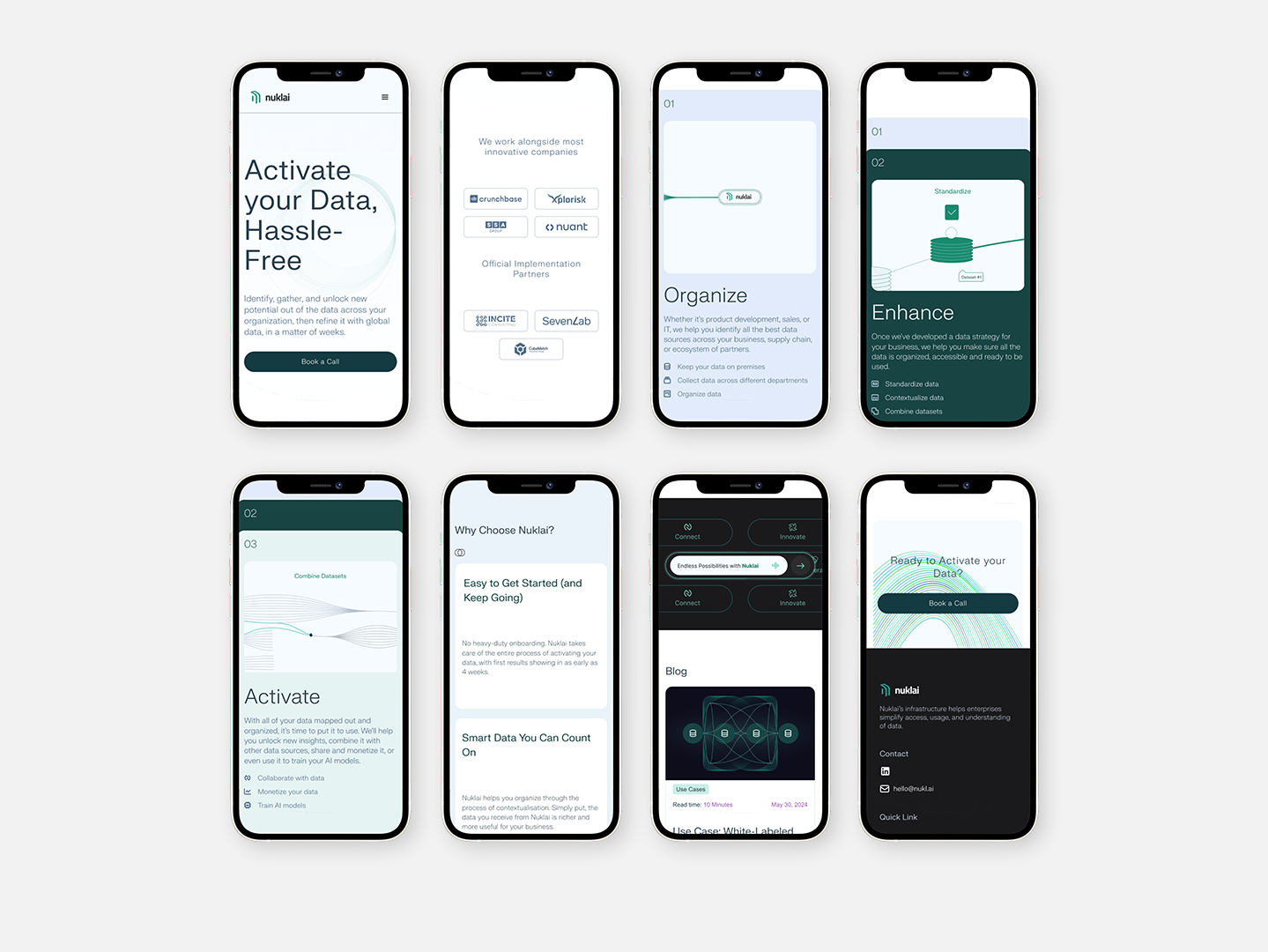
One of the first tasks was defining the typography and color palette. I presented several options to the Leadership team, aiming to create a modern, professional brand while ensuring clarity and accessibility for users working with complex data. Given that data management can often feel overwhelming, I focused on a design approach that emphasized simplicity and ease of use—from the color palette to UX microcopy. The platform’s tone needed to be clear, informative, and supportive, helping users navigate their data efficiently without adding unnecessary complexity.
Next, I established the design foundations by creating a series of page templates. Following best practices for data-heavy dashboards, I explored different approaches to information architecture, navigation, and filtering systems to enhance usability. Collaborating with front-end engineers, we defined a responsive grid system aligned with their setup in Tailwind CSS, ensuring scalability and consistency across different screen sizes.
The next step was building a continuously evolving set of components, following the Atomic Design methodology. Through ongoing collaboration with developers, we ensured that naming conventions and component organization were intuitive and effective for both design and development. The Design System was mirrored in Storybook, enabling a seamless and structured workflow that kept the process efficient and aligned across teams.
Accessibility baked into the process
Building a Design System from the ground up allowed accessibility to be integrated into the process from the start, rather than treated as an afterthought.
Some key principles we prioritized included:
• Checking color contrast across different backgrounds and interaction states (which led me deep into accessibility standards, especially for disabled buttons).
• Ensuring font sizes and touch targets on mobile were appropriate for usability.
• Including text labels with icons in mobile navigation for better clarity.
• Maintaining consistency across layouts and similar UI elements.
While there’s always room for improvement—given the necessary trade-offs and time constraints—this approach set a strong foundation, ensuring that accessibility remains a core part of the design process and a shared responsibility across the team.
Pragmatic innovation
Practical innovation is a concept that resonates with my approach to developing the Design System. When working on more complex screens, there were moments when I had to step away from the established rules to think outside the box. This involved introducing new components or rethinking existing patterns. It was essential to be discerning about when to break the mold and incorporate something fresh, while still maintaining the integrity of the system.
Asynchronous communication
A set of components alone isn’t enough to sustain a successful Design System; it’s essential to provide the context needed to make it accessible to a range of internal users. Where possible, I aimed to:
• Explain the rationale behind my design decisions (during discussions with the Leadership team)
• Demonstrate behaviors, interactions, and various states (during handovers to the developers)
• Reference research sources and alternative options considered (for future designers and the wider Product team)
Although we held weekly grooming meetings with the Head of Product and developers, there wasn’t enough time to cover all interaction details. In a fully remote team, asynchronous communication becomes crucial. I wanted to offer the necessary context around designs without creating yet another dreaded document.
Thus, my handovers included contextual notes within Figma files, video walkthroughs for specific interactions or complex flows, and visualizations of expected behaviors in static files. Additionally, when new components were added to the library, I linked the screens to the component set, ensuring developers always had access to the source of truth.
Results
In under two months since starting the role, I completed the redesign of the tool in time for the MVP launch. The Design System played a key role in ensuring a successful launch:
• It provided a cohesive look and feel for the rebrand
• It gave me a structure and a set of principles to return to when making decisions on sometimes conflicting requests from the wider team
• It streamlined the design process, which was key for a solo designer
• It led to a faster design to market time, providing developers with a single source of truth and a set of reusable components and patterns
